Objective: Create your own business. You must create a letterhead and identity set, packaging related to the type of products your company deals with, and a company website.
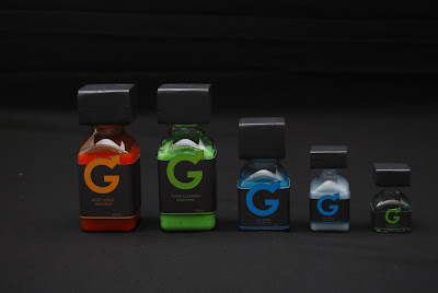
Solution: I chose to create a business that produced men's grooming products. I wanted the company to have a modern and clean, yet edgy feel to it. I wanted to make sure that I made specific decisions to create something that would stand out from the current companies on the market. The business name I came up with was Swagger. The name has an edgy and confident sound to it, but can retain a sense of class. As the company packaging states... "Swagger Manscaping Utilities are specifically designed to help you maintain your edge. The last thing you need to worry about is having your swagger taken away by some inferior grooming product. So lift your head high and get your swagger on." I also chose to use the line "Fine Manscaping Utilities" rather than "grooming products" to create that separation from other grooming products out there. For the logo I decided to play off of the repetitive G in the word swagger. I wanted to make sure that the symbol of the company retained that modern yet masculine feel. This is why I went with a G turning into the male symbol. The colors I chose to reflect a modern male are shades of gray mixed with clean shades of green, orange, and blue. For the letterhead and business card I wanted to highlight the shape and design of the G logo. I had a clear picture of what I wanted the packaging to look like, something that would be bold yet refined looking. I found various sizes of a cool square bottle, and then covered the lids with square blocks to give it that edge. I wanted to make sure the packaging highlighted the uniqueness of the square lids so I chose to leave the lids exposed outside of the packaging. To bring in some balance in shape I used a variety of round containers for other grooming products and painted the lids gray to unite them with the packaging set. The different colors represent the various scents found in the product line. Green is "Clean Mint", blue is "Cool Menthol", and orange is "Crisp Citrus." I wanted to have a variety of products to show a complete set and demonstrate the different uses of the company's colors in packaging and labels. All the labels, boxes, and letterhead were printed on a white pearl metallic paper to enhance the colors and crispness of the design.
Letterhead

Envelope/Business Card
Packaging


