Objective: Create a business. You must create a logo, letterhead (including envelope and business card), packaging for what ever product your business will sell, and a website.
Solution: I decided to create a clothing company. The company would cater to skaters and snowboarders. I wanted to give the company an east coast feel because a lot of the current companies that cater to the same target market are from California. I decided to name the company immix apparel. The word immix means to blend or mix together different elements. I thought this was fitting for a company that deals with different sports, weather elements etc. I chose black, gray, and red for the company colors to keep with the cold and rigid east coast feel. I wanted to have the unique shape of the logo echoed through different aspects of the project. For the packaging I really tried to bring in different textures that you might find in an urban environment. The shopping boxes are sprayed with an asphault and concrete type texture. The box handles are made from metal cable. I also made a metal hang tag and key chain out of brass, that has the logo etched on it. I wanted to take an unconventional approach to the website. I designed it so that all the page elements would fit on one page so you would not have to scroll down. This allowed me to move the navigation to the bottom of the page. The product selector allows you to pan from left to right to select a product or sponsored athlete. When a product or athlete is selected the large image rotates, showing a 360 degree view.
Letterhead

Packaging 


Website


Thursday, December 4, 2008
immix apparel
Posted by James Walker at 5:17 PM 0 comments
Wednesday, October 29, 2008
Post-it Notes
Objective: You must design an ad campaign for a product that will be drawn at random from a bag. You must come up with a tag line and headline for three different ads for the campaign. You must have one print ad and two other types of ads.
Solution: The product I drew this time was Post-it Notes. In my ads I wanted to show that Post-it Notes are good for reminders and everyone uses them. What better way to do this than show Post-it Notes that famous people might have written as reminders. For my tag line I came up with "Get the message." I liked this because it shows that Post-it Notes are successful in in passing along information. Also, it relates back to the ad by saying these people could have used Post-it Notes to successfully pass along their message. In order to make my ad stand out from other ads I wanted to take advantage of the canary yellow color that is pattented by Post-it. This is why I placed the note on a white background. That way it was like someone stuck the note there for you to read. The first picture is my print ad that would go in a magazine. The second and third pictures are of my ad campaign in billboard form. I placed it on the billboard it would be on. The billboards can be site specific ads. The forth and fifth pictures are of my unconvetional advertising methoid. I came up with the idea to place a giant sticky note on the side of a building in Times Square in New York City like someone had put it there for a reminder.


Posted by James Walker at 3:36 PM 0 comments
Friday, October 24, 2008
Krazy Glue
Objective: You must design an ad campaign for a product that will be drawn at random from a bag. You must come up with a tag line and three different ads for the campaign. Each ad must have a successful headline.
Solution: I wanted to take a sarcastic approach to this ad campaign. Each ad would show the glue being used to do something extreme. I also wanted to include a characteristic of the glue in the headline. To play off the unrealistic scenes in the ad I came up with the tag line "It's that krazy". The ads were well received. I even won an iTunes gift card for having the best ad campaign in the class.
Posted by James Walker at 4:16 PM 1 comments
Wednesday, October 8, 2008
Target Ad
Objective: Create a new ad campaign for Target. Target has a distinct look to their previous ad campaigns. You must be original but capture the "Target feel" in your ad. You must come up with a new tag and create 3 original ads for your campaign.
Solution: I chose to focus on the fact that Target gives five percent of its profits to the arts and other causes. I wanted to create an ad campaign that not only showed art but also advertised a product that Target sells. Andy Warhol's art was the perfect choice for this. I came up with the tag line "shop smart." By shopping at Target not only are you smart by purchasing quality products and a good price, you are also supporting the arts.


Posted by James Walker at 3:42 PM 0 comments
Wednesday, August 13, 2008
Visual Argument
Objective: Create a visual that successfully communicates a particular idea or belief.
Solution: I decided to use the idea that some (notice I said some and not all) congressmen are greatly influenced by lobbyists and their deep pockets. I came up with the idea of using the gavel because that is widely associated with courts and law making. I made the "money gavel" represent the lobbyists. This is to show them pounding their agendas into congress with money.
Posted by James Walker at 3:14 PM 0 comments
Cetaphil
Objective: Create an up to date logo for the skin care brand Cetaphil. The logo must reflect the product and the tag line. The logo must also include a ligature (a stroke that joins adjacent letters).
Solution: When I think of a skin care product I think it should be light and refreshing. In order to portray this in the logo I used a clean and simple typeface. I also used a lighter shade of blue and green because those colors have a clean appearance to them. I also created the wave through the name to give of a light free floating feeling. This wave, along with the joining strokes in the letter E and T, also help to satisfy the ligature requirement.
Posted by James Walker at 3:01 PM 1 comments
Jean Company
Objective: Create the name, the look and the promotional material (including hang tags) of a new jean company. You will create one name but create 3 different visual directions for the following potential markets.
1st market - young western wear - traditional market inexpensive price comparison
2nd market - young urban wear - new luxury market high dollar, high fashion
3rd market - global - jean companies n general are finally going global. The company purchases textiles and construction in China and India and would like to see a visual that reflects that. You must research each market to ensure you logo works.
Solution: The name I came up with was True Jeans. I felt that this name embodied individuality and would be versatile in the markets it appealed to. For each brand I created a hang tag and an envelope containing a authenticity card.
The paper I used for the envelope, card, and hang tag for the western market has a suede feel to it.
The black paper I used for the urban market has a rubber feel to it, and the silver cut out on the envelope is made from a metal screen.
I wanted to create an interesting envelope for the global market so I came up with a way to have four sides fold together to enclose the card and show the logo.
Posted by James Walker at 12:06 AM 0 comments
Beverage
Objective: Come up with a name and logo for a beverage. You must use a symbol system in your design. You must find a bottle to use and create some sort of packaging for your chosen beverage.
Solution: I chose to do a flavored bottled water. I wanted to have a exotic feel to my product so I chose the name TEVAI which means sacred waters in Tahitian. The phrase "Hina’aro oe e inu" is Tahitian for "do you want a drink", which I used as my slogan. The flavors which I chose were mint and lime. I took thin sheets of bass wood and soaked them on water and covered the lid and also used the wood to make an outer sleeve to hold the bottle.
Posted by James Walker at 12:05 AM 0 comments
Symbol Project
Objective: The purpose of this project was to create a basic symbol from a common everyday item. Then we were to take our symbol and use it to solve creative problems...turn it into a metaphor, alter it to completely change its visual meaning, create an interesting pattern...those were a few of the 15 or so creative problems. We also had to create something that would house our solutions that in some way reflected our chosen symbol.
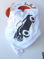
Solution: I chose to use a car for my symbol. The way I came up with the idea of making a shop towel container to hold my symbol collection. This idea came after walking up and down the isles at Pep Boys for about an hour or so. I made the container out of foam, poster board, and glue soaked velum. I took actual shop towels and ironed on my ten favorite symbol solutions and stitched the corners together, this way they would pull out of the container one right after the other. It was a lot of work but the finished product was well received.
Posted by James Walker at 12:05 AM 0 comments
Brochure
Objective: Create a brochure advertising the art department at UT Arlington that would be sent to prospective students. The brochure must have at least eight pages and be visually appealing to peak the interest of readers and display the skill of UTA students.
Solution: I came up with the idea to focus my brochure around doors and fire escapes. The main theme of my brochure was "open doors and escape the mundane", insinuating that attending UTA will open doors for you in your life to give you experiences. I wanted to use my own photography so I went to downtown Dallas and took pictures of fire escapes and random doors. I really enjoyed the creative process on this assignment and seeing it all come together.
Posted by James Walker at 12:04 AM 0 comments
Alphabet Soup
Objective: Find every letter of the alphabet in your surroundings. You cannot use a process that was used to create a letter more than once. Then compile your findings and present them in some type of a book.
Solution: After taking pictures of all the letters in the alphabet I decided to give my presentation an industrial type of feel. I put a grid on each page, placed the original picture in the center of the grid, and then inverted the image and place that in the lower right corner. On the back page I took each image and made half of it inverted. I then cut the actual cover of the book out of sheet metal, riveted hinges on it and bolted all the pages together.
Posted by James Walker at 12:02 AM 0 comments


